ge·om·e·try
/jēˈämətrē/
Geometry (Ancient Greek: γεωμετρία; geo- “earth”, -metron “measurement”) is a branch of mathematics concerned with questions of shape, size, relative position of figures, and the properties of space. A mathematician who works in the field of geometry is called a geometer. (Wikipedia) A mathematician who creates using the rules of geometry is a graphic designer.
Script is a word with various meanings. In the field of design, script means a letter set in which one or more letters connect to each other making fluid typography. There are many types of script – brush script, cursive (where all letters connect with a line, as if a pen wrote out the type), and geometric. Most script has some influence of sign painting, where script fonts and type sets originated from.
In this article, we’ll go over the process of geometric script, brief typographic history & classification, basic typography rules, basic typography layouts, and fixing typographic mistakes.
Anatomy of Type
Typography is a beautiful craft in which you create letters, either hand drawn or as of recent, digitally. Most typographers start on paper, as with any other artist. Many typographers stick to a set of rules and limits to your letter height, width, and slant to keep your type set related & consistent. In reality, there are no rules, there are no limits, and it is encouraged to break boundaries to create new type. There are different classifications for fonts and therefor different rules to abide by. Such as a serif font – see Times New Roman, Georgia, Alegreya, or Garamond. These fonts have serifs which are extensions of ascenders & descenders to give a more sophisticated look to a font. These letters are some of the oldest type sets to date, and still in use today because they are legible and clean. Next we have sans serif fonts, which are fonts without these extensions. See Myriad, Helvetica, or Tahoma. These fonts are more modern because they evolved from serif letters. To increase neatness, legibility, and effectiveness, typographers decided to drop the serifs on fonts and abide by geometric rules. Most fonts that are commonly used are based on strict geometric rules & shapes. Those are the two most important font classifications to know about but there are so much more – black letter, block serif, upright italics, display, brush, handwriting, and script. That’s just the tip of the iceberg. Today we’ll be going over geometric script.
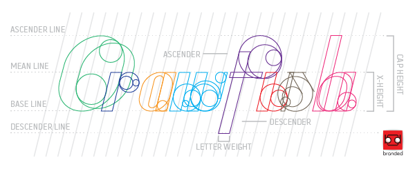
See below, and notice the parts of the letters we labelled. You can create your own grid like this, but if you’d like to use our grid, feel free to email me at pete@brandedscreenprinting.com
This layout can be applied to just about any letter set, including the one you’re reading right now. See if you can label the parts of the font I’m currently using.
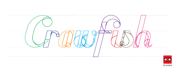
The type above was my first step. This is some script I did for a one of our clients. They did not ask for a custom font, but we chose to do so anyways. There is nothing better than a 100% custom logo type. It is irreplaceable, and nobody else has the letters that we can make for you. This is essential to a strong logo. See the geometry used to create letters. Try using circles for curves, and consistent angled lines for the italicized look. It is imperative for your letters to look like they belong together. Let’s clean it up a bit – it looks like a mess of circles and lines right now.
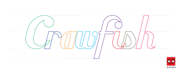
Ah, that’s better. Notice the use of circles to create consistent & natural curves. Continue cleaning it up and merge your shapes to get your true letters.
Well look at that, who knew that every letter – lower case or upper case – in a script font such as this was created using circles and lines. The possibilities are endless when you use these two very important geometric tools. Try experimenting – use hexagons, triangles, or squares to get a desired look. Look into shape psychology and it totally translates as well. A jagged script created via triangle will have an edgy, sporty feel to it. Remember what I said earlier – please, break the rules. Graphic designers love to see new things. Let’s fill in our font.
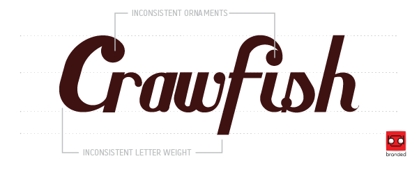
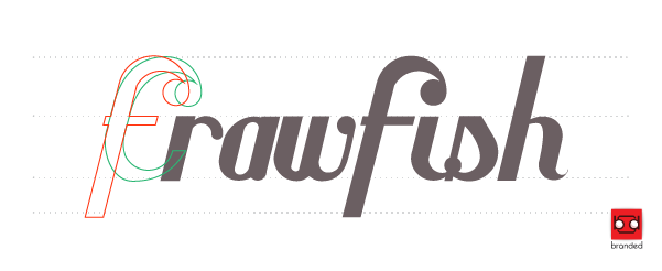
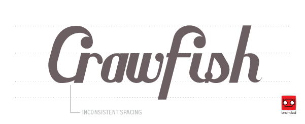
It looks… Odd. Notice the inconsistencies. You can embrace these inconsistencies if you tie in your other letters with the inconsistencies, such as varying letter weight and ornaments, but for the blogs sake, let’s just make all the letters similar. Being able to correct your mistakes is essential to graphic design, and fixing your mistakes correctly can be a serious challenge. Let’s reference the other letters to fix these mistakes, for consistency’s sake.
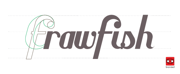
Let’s reference the “f” because it has a sweet ligature. We’ll use the same process that we used initially to create these letters.
Ah, the consistency. Let’s merge the shapes together.
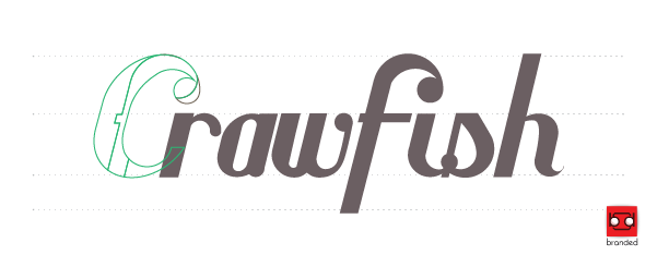
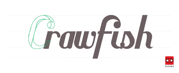
Without the excess, it’s looking pretty sharp. But wait. The letter weight is off. Let’s fix that. To clarify, in some cases it is good to have a heavier letter weight for your capital letters. What looks good, looks good, and sometimes it just does without explanation. Most of the explanation stems from psychology to the way your eyes perceive light. Let’s reference the “f” again to get a more consistent letter weight.
We’ll shape the “c” to the “f” and clean up the shape.
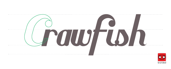
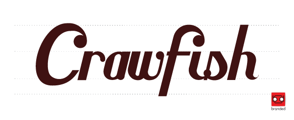
So much better. The letters truly belong together now. Consistent ornaments, consistent spacing, this is really coming together. Fill in our shapes and we should be done, right?
It’s good. It looks good, it’s consistent, but I feel like it is a little cramped between the “c” and the “r.” I’ll smooth out the “c” for some aesthetics and match the spacing to the rest of the letters and let’s call it good. You are able to call adjustments such as this with experience.
Beautiful custom type. Irreplaceable. 100% custom. Fields like typography are a totally different animal than laying out a business card, or designing t-shirts. The typography in both of those fields is one of, if not the most, important part of t-shirt design & business cards. Letters are a part of every day life and communication, and somebody has to put a face on them. Continue practicing and see where it takes you. Practice hand drawing script such as the script we went over in this article. Practice digitally designing your script. Practice styling your letters. Try creating an alphabet. Draw some serif letters. Draw some sans serif letters. Invent your own. Most importantly, just practice. Memorize fonts, reference fonts, and choose favorites. Figure out the font on the menu when you’re out to eat. These are all daily activities to continue pursuing typography and ultimately developing.
Thank you for reading. If you have any questions, comments, or are interested in getting some custom type for your company, feel free to email me at pete@brandedscreenprinting.com.



![GeometricScript[finished-product]](http://www.brandedscreenprinting.com/wp-content/uploads/GeometricScriptfinished-product.jpg)