mon·o·gram
/ˈmänəˌgram/
noun
-
a motif of two or more letters, typically a person’s initials, usually interwoven or otherwise combined in a decorative design, used as a logo or to identify a personal possession.
Monograms have been around for hundreds of years. Historically used as a royal signature, monograms have grown to be a popular and strong aspect of companies & sports teams alike. Ancient Greeks as well as Romans used them to identify their rulers on coins. I see monograms as the true art of typography, showing total control and knowledge of type.
In this article you will be able to see the creative process of a monogram, as well as the anatomy and types of monograms.
Anatomy of a Monogram
Most commonly, monograms consist of two letters. Traditionally – specifically talking about the Victorian era – monograms consisted of three letters. Why? Royalty. High-class Victorians adopted monograms for personal use and to show class. There were rules to the monograms in that era. Feminine monograms began with first initial on the left, last initial large centered in the middle, and middle initial at the end. These were typically embroidered. Today, there are no rules. As long as you can depict the company you are creating your monogram for, it is encouraged to break the rules and develop new styles.
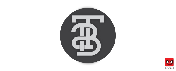
Here’s a good example of one of my own unconventional monograms. The monogram maintains the traditional hard edges and slab serif that gives a monogram its look, but takes some unusual curves and added linework for an added effect and unique look to it – which is imperative in our day in age of design and technology.
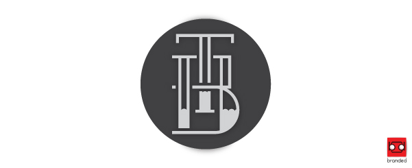
Another example from the same job. Again, having a unique monogram is key to a successful logo.
Let’s look deeper into these monograms, and what goes in to making them. For those who are not as tech savvy, I’ll try to keep it simple. Designers, feel free to email me and ask questions at pete@brandedscreenprinting.com.
The Creative Process Behind a Monogram
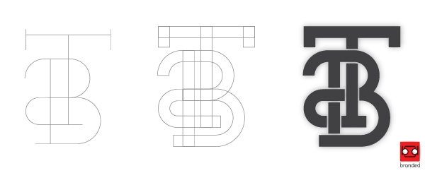
The image above shows the blood and guts of the first T&B Electric monogram. As you can see, there was no fonts used in this monogram whatsoever. This is a huge thing for modern day design. Some fonts are common, a lot of fonts are overused. Why would you want a font in your logo that hundreds of other companies may have? Again – be unique!
I started thumbnail sketches on paper. Even though we have computers in this day in age, pen and paper has not gone away because your initial sketches and concepts are what fuel a strong design.
Next, I layed out my “paths” which are used to create “vector” shapes. Vector objects are infinitely resizeable and preferred in most, if not all creative & printing industries. Starting with paths gives you total control of your monogram. You can make it thicker, you can make it thinner. You can inline it, as well as outline it. Want rounded ends? You can have rounded ends if you begin with paths.
After I smoothed out my paths, I outlined these paths to make them even more editable. Here you can see the true anatomy of the monogram as well as a visual lesson in typography. The monogram is almost complete, now the challenge of linking the two letters together similar to a chain. Traditionally, the parts of the letter that are in front of the other alternate positions. If you see the far left edge of the B, the parts of the letters alternate – over, under, over, under. This is important because it draws curiosity from your customer and really puts your logo in their memory.
Here’s the anatomy of another monogram of mine:
In this example, it starts with paths. From paths, I converted them to objects as I did with the previous monogram. The difference between this monogram and the last, is that there is a certain uniformity throughout the monogram. I used the same line weight for both spacing and outlining the monogram. This creates a feeling of solidity and consistency throughout the monogram.
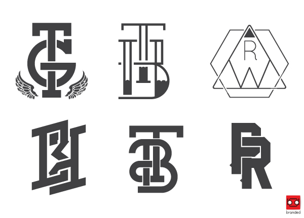
Take a look (only a few) of the monograms that have come out of Branded for clients. Monograms are a great way to stylize your company with a neo-vintage look that people will not forget.
Monograms are tried and true, and many famous companies and sports teams use them for logos because they are powerful and one of a kind. There are so many variations and ways to approach a monogram. In the end, the possibilities are endless and always bring beautiful typographic results.
If you have any questions, feel free to comment below and I will respond to them promptly. If you are interested in getting a monogram logo created for your business or sports team, check out our graphic design page and I will gladly create a powerful look for your business. Thank you.

